Regional analysis
The single point analysis interface also allows creating a regional analysis, which involves repeating calculations (e.g. accessibility to multiple destination opportunity layers) for a specified batch of origin points.
Starting a regional analysis
To start a regional analysis, first fetch results for a single origin with the appropriate project, scenario, travel modes, time of day, and other parameters set.
Once results for a single origin are displayed, Regional analysis will be enabled. This button is disabled until isochrones are computed and displayed. This is a verification step, avoiding regional analyses that might stall or become unresponsive due to certain invalid combinations of settings.
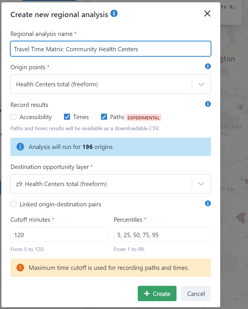
After clicking Regional analysis , give the analysis a name and set additional configuration options as described below.
Select origins
Under Origin points, you can select Default Rectangular Grid or any previously created freeform pointset.
If you select Default Rectangular Grid, results will be raster maps showing your selected metrics for each point in that grid. You will also be able to select the desired spatial resolution under Origin zoom.
If you select a previously created freeform (non-grid) pointset, results will be downloadable CSV files.
By default, access for the entire region is analyzed, but it is also possible to analyze a smaller area. You can set smaller bounds of the analysis by clicking "Bounds of analysis: Set custom " in the analysis panel, then dragging the pins on the map. Or you can select a previous regional analysis and reuse its bounds.
In regional analyses, all destinations in the region, even those outside custom bounds, will be included in access calculations.
Result types
You can use a regional analysis to compute different types of results. Options under Record results include:
- Accessibility: cumulative opportunity or decay-weighted access-to-opportunities metrics for each origin (default option)
- Times: travel time matrix for each origin-destination pair (requires freeform origins and destinations)
- Paths: public transport itineraries for each origin-destination pair (requires freeform origins and destinations)
- Dual access: time needed to reach a threshold number of destinations.
Dual access results
The time needed to reach a threshold number of destinations (such as a health center or three grocery stores), also known as "dual" accessibility, can be calculated in Conveyal. Dual access can be calculated with grid or freeform spatial datasets. For more details, see this paper or the TransitCenter Equity Dashboard.
If this option is selected, you will also see a field to enter the desired thresholds. For example, 3 would yield time needed to reach third-nearest grocery store with grocery stores selected as a destination layer, and 10,000 would yield the time needed to reach 10,000 jobs with jobs selected as a destination layer.
Select destinations and run analysis
Select at least one Destination opportunity layer:
- When using grid spatial datasets as destinations, you may specify several grids. They may be of different sizes and shapes (but must all be at the same zoom level). In each grid, the number of cells is limited to a maximum of 5 million, and the number of opportunities is limited to a maximum of 2 billion.
- When using freeform spatial datasets as destinations in a regional analysis, you can specify only a single layer for now. The maximum number of freeform destination points is 4 million (and the maximum number of freeform origin-destination pairs is 16 million). Grid and freeform destinations cannot yet be mixed.
If you only need results for matched origin-destination pairs (rather than every combination), activate Linked origin-destination pairs (more details here).
Ensure the list of travel time cutoffs and percentiles will cover the results you want. For example, if you want a travel time matrix to include trips up to 120 minutes, ensure that 120 is included as a cutoff; any travel times exceeding the maximum cutoff will be clipped and recorded as -1 (in travel time CSVs) or 0 (in dual access results).
Finally, click Create to start the analysis.
Computation time
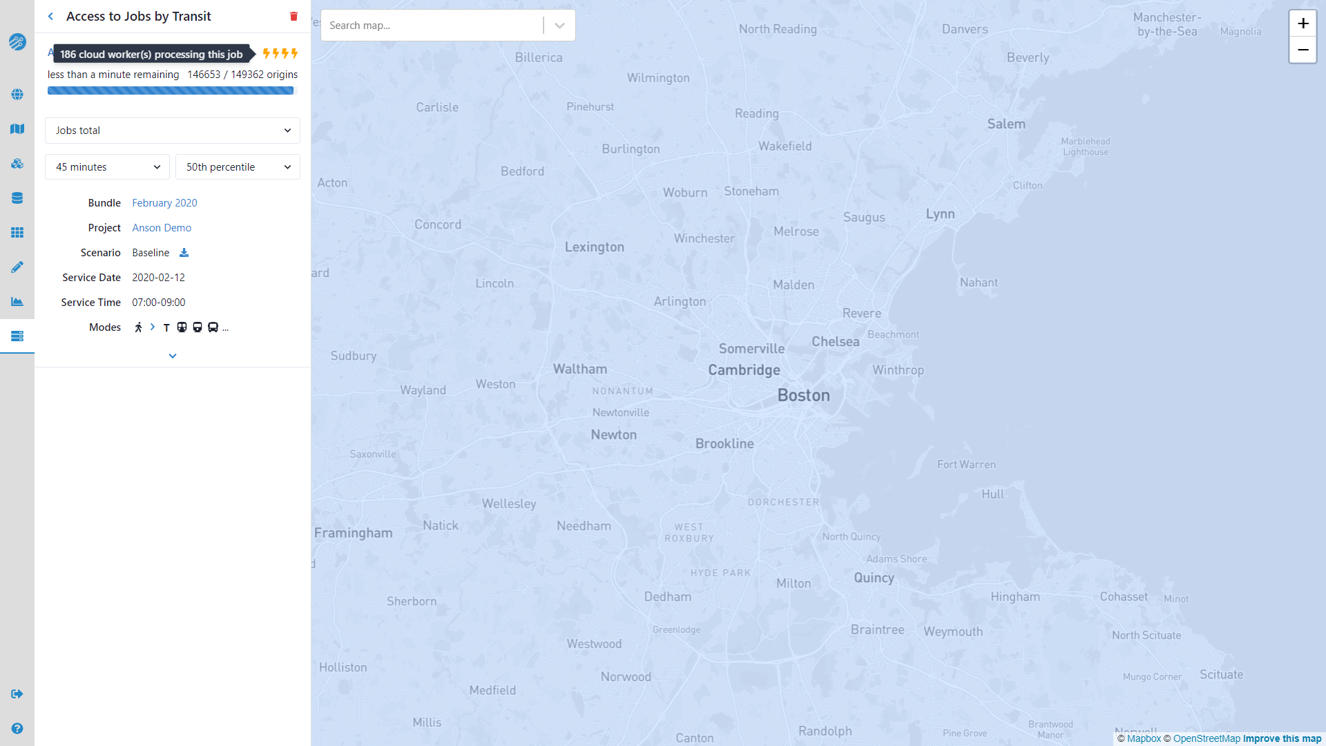
After creating a regional analysis, it will appear in the list of running regional analyses with a progress bar. Conveyal will automatically scale up computation, so it should not take more than a few minutes for most walking plus transit regional analyses to complete. If you want to reduce computational time, consider setting custom geographic bounds as described above.
Once a regional analysis is complete, it can be viewed by selecting it from the drop-down menu, which will take you to the regional analysis view.
Inspecting results
Upon selecting a completed regional analysis, you will see a screen like the following:
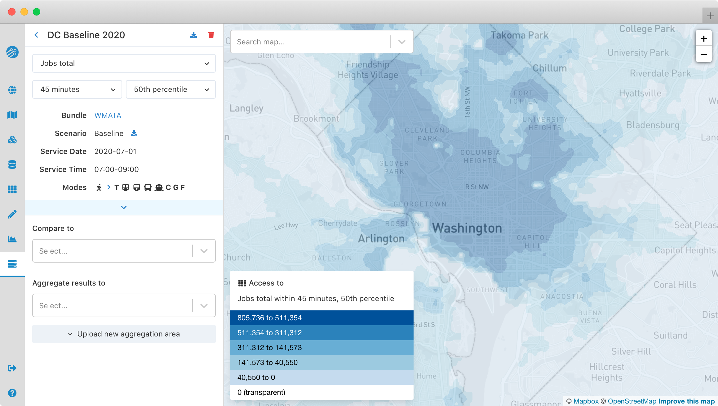
When accessibility results have been computed grid origins, the map will show the number of opportunities accessible from each origin. Any destination opportunity layers, travel time percentiles, and time thresholds specified when you created the regional analysis can be interactively selected.
If dual access results were computed for grid origins, the map will show the time needed to reach the selected threshold number of opportunities from each origin. Any destination opportunity layers, travel time percentiles, and opportunity thresholds specified when you created the regional analysis can be interactively selected.
Map display options
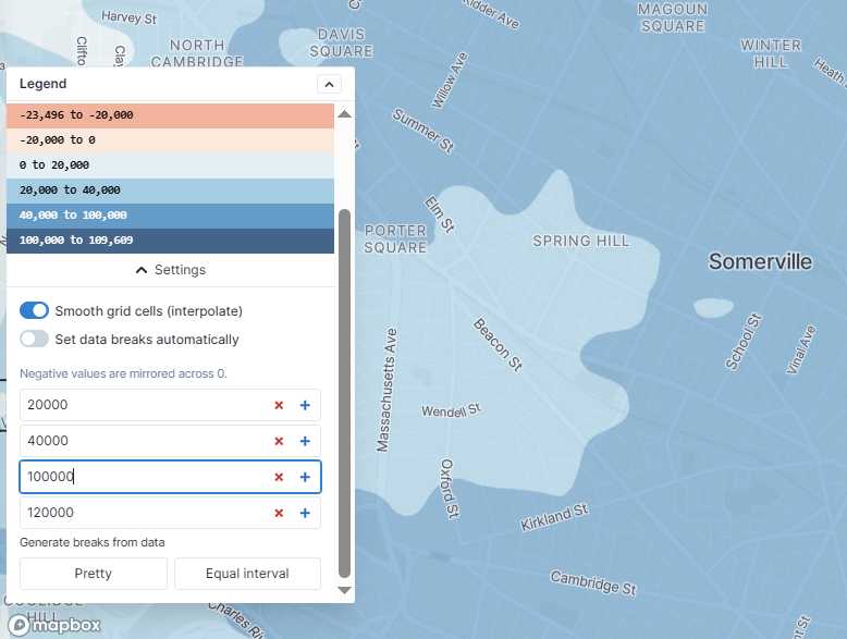
The Settings panel at the bottom of the map legend provides options for customizing the map display:
- The default map interpolates values between the grid cell results for a smooth looking map. To disable this interpolation, toggle off "Smooth grid cells (interpolate)"
- To set custom breaks for the color bins, toggle off "Set data breaks automatically" then adjust values in the form below
- By default, automatic data breaks are calculated using CKMeans clustering, similar to Jenks natural breaks. To use equal interval breaks instead, toggle off "Smart data breaks"
- "Generate pretty breaks from data" populates the breaks with "nicely-rounded" numbers from D3.js.
Downloading regional results
For more advanced display and processing of regional accessibility results, you can download the results and open them in GIS software. This allows you to create maps with custom color bins or your own basemap layer, or even compute custom indicators. The download button for a selected regional analysis allows you to save results in the GeoTIFF raster format, which is supported by most common geospatial software. Working with the downloaded raster data also allows you to see the raw grid cells used for analysis, rather than the smoother interpolated results shown in your browser.
If you are using QGIS to process downloaded raster layers, you will likely want to style them with a "singleband pseudocolor" scheme. If you prefer to work with the results as a regular grid of vector points, you may find the "Raster values to points" tool in the QGIS processing toolbox helpful.
For regional analyses run with freeform origins, results are available for download as CSV files and are not shown on the map.
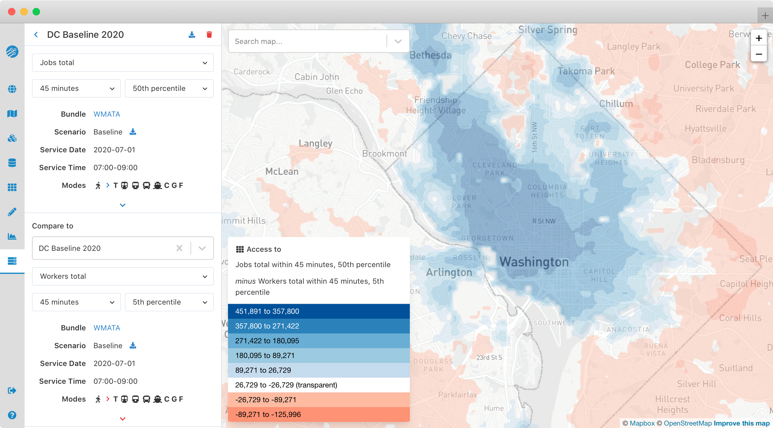
Comparing regional analyses
You can also compare two analyses to highlight changes in access across a region. Analyses must share the same bounds and zoom level to be compared. After you select a Compare to region, the map will show the difference in accessibility between the two analyses, with blue areas showing increased accessibility, and red areas showing decreased accessibility. Direct download of the comparison will be available in a future Conveyal release. For now, you can download the analyses being compared separately, then perform raster subtraction, further analysis, and styling offline (e.g. with the QGIS Raster Calculator)
Measuring aggregate accessibility
To summarize accessibility in a single metric or indicator, you can use Conveyal to aggregate the results of a regional analysis. This feature allows you to calculate a summary statistic for an entire aggregation area (e.g. city, planning organization boundary, neighborhood, city council district, transport authority service area, etc.). For a selected aggregation area, you can report the distribution of accessibility in that area, weighted by a value (e.g. population or households) at each grid cell origin.
Uploading aggregation areas
In order to accomplish this aggregation, you first need to convert a spatial Data Source with polygon features to an aggregation area with a zoom level matching your regional analysis. Once aggregation areas are processed, they are available for selection in the details panel for a completed regional analysis.
Viewing aggregate metrics
To view aggregate metrics for a regional analysis, select an available aggregation area and the origin spatial dataset you want to weight by, both of which must have the same zoom level as the regional analysis. For example, for a z10 regional analysis of access to jobs, you might choose a z10 spatial dataset of workers by home location for the origin weights.
The choice of aggregation area can have a significant impact on the final metric. If a very large area is chosen, where much of the region does not have transit service, there will be a large number of people with very low job access via transit, deflating the aggregate numbers. Conversely, if a small area is chosen, segments of the population that should be served by transit will be excluded from the aggregate metrics.
Once you have an aggregation area and origin weight selected, you will see a display similar to the one below, showing how accessibility is distributed across your chosen origin population. For example, if you select "Total households," your histogram will represent how many households experience different levels of accessibility. If instead you select "Workers with earnings $1250 per month or less," you will see how accessibility is distributed among workers with low earnings.
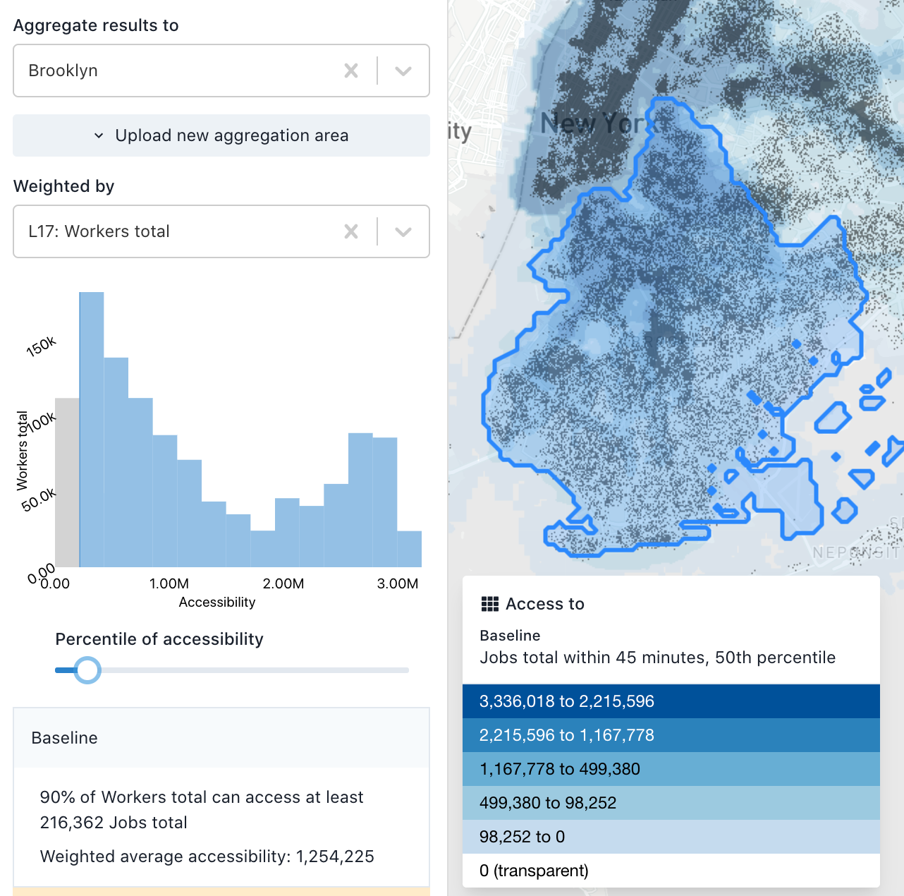
The plot is a histogram of the number jobs accessible within the full destination spatial dataset (not just Brooklyn) for workers residing in Brooklyn (since this is a regional analysis of access to jobs, aggregated to Brooklyn, and weighted by workers). We can see that the distribution is bimodal. There are a large number of workers with relatively lower accessibility values (the left peak), most likely residing in outer Brooklyn further from the subway and from job centers. There are also a number of workers with a higher level of accessibility, probably those residing in downtown Brooklyn and near Manhattan. This plot is conceptually similar to academic work on accessibility by population percentile (e.g. Grengs et al. 2010).
Below the histogram is a readout of the metric mentioned above: how many opportunities are accessible to a certain quantile of the population; in this case, 90% of workers residing in Brooklyn have access to more than 267,000 jobs. You can adjust the percentile by dragging the slider. The area of the histogram above the cutoff is highlighted. By setting it below 100%, you are effectively recognizing that some percentage of a given region may not be feasible to serve with transit, so accessibility metrics should not be penalized for the lack of access in those areas.
You can also view these aggregate metrics when comparing two regional analyses.
In the example below, the baseline scenario is shown in blue and an alternative scenario is shown in red, with a darker area where the two overlap. The horizontal axis is a scale of number of jobs accessible within 45 minutes. The height of each histogram bin represents the number of households who have the corresponding level of job access. The farther to the right the red distribution is, the higher the job access gains across households.
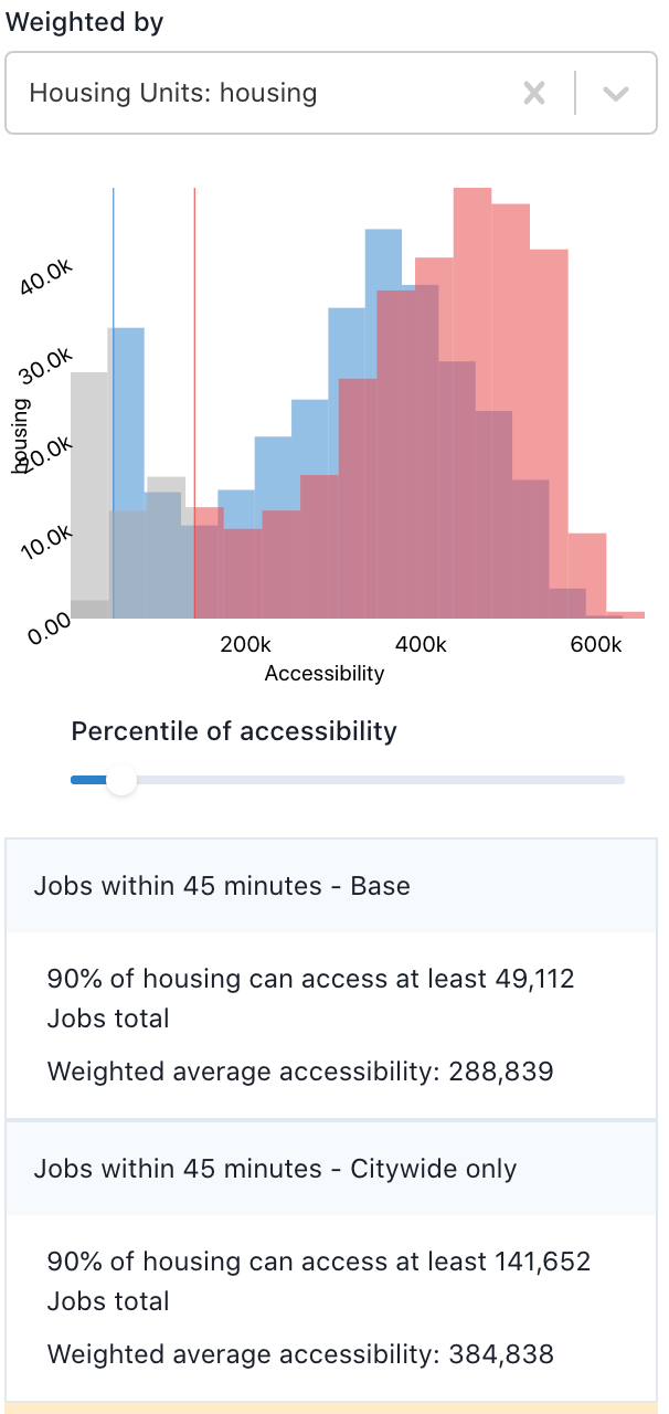
In the baseline, the 10th percentile household (marked by the leftmost vertical line) has access to fewer than 50 thousand jobs, while in the alternative scenario, the 10th percentile household (the second vertical line) has access to more than 141 thousand jobs. The large increase at the lower end of the distribution suggests the alternative scenario could help advance more equitable access to jobs.
Finally, Conveyal displays weighted mean accessibility, which represents the average accessibility experienced by residents (or whatever unit you have weighted by) in the aggregation area. Aggregate accessibility is often bimodal or skewed with a long right tail. In such cases, a substantial majority of the population may experience accessibility values well below the mean, so we generally recommend reporting different percentiles of aggregate accessibility rather than the mean.